We really love your feedback and feature suggestions. Therefore, we are proud to tell you that there is a major update available for our Android phone and web app. Not only the design is different, but also some great features have been implemented within the last few weeks.
Great improvements for mysms for Android phone
First of all we’d like to introduce you to the new mysms for Android phones:
1. Color your life
Standard design
mysms for Android phone got a new look. The subtle grey has gone and is now replaced by a fresh blue. It looks clean, stylish and simply great! Moreover, we’ve adapted the pop-up and widget – find more information below.
Themes
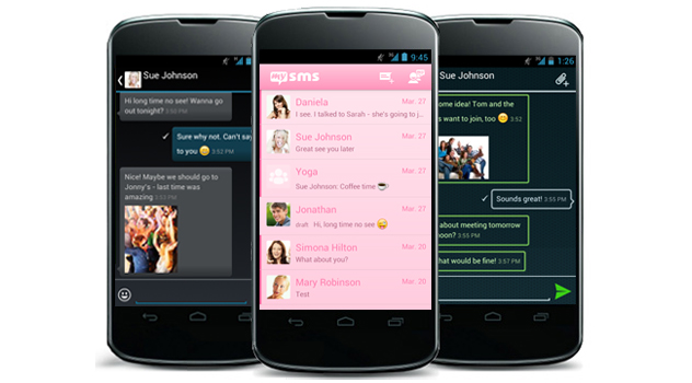
If you still want to get rid of the basic design, we’ve got really great news for you. We know that you have been waiting for this for a long time, but finally new themes are available for mysms. We now provide you with the following cool styles:
- mysms – Dark Theme
You might know this one, as it was already downloadable. We made some major improvements, so it’s even more fun using it now. Did you know you can use it for saving battery? - mysms – Tron Theme
The tron theme gives mysms a breezy and fresh look. So, if you’d like to be in a cool mood, this theme seems perfect for you! - mysms – Pink Theme
Hey feminine mysms users, this one’s for you: With this theme the app shines in pink and gives mysms a bright look. This theme will make you smile every time you use it.
Wallpapers
There’s an additional way to personalize your mysms Android app: You can add wallpapers from your gallery for the background of the conversation view. You’ll find this feature in the mysms settings. It’s available for every theme as well.
2. Show your emoti(c)ons
Tell your friends how you feel by using the integrated smileys and emoticons. Just press on the smiley button next to the input field and your software keyboard will change into a smiley keyboard.
3. New overview of incoming messages in the pop-up
You might have already used the pop-up for notification of incoming messages. Besides direct reply, it’s possible to switch between conversations. If you receive messages from more than one recipient, you can switch to the other conversations by wiping or clicking on the arrow next to pop-up. Moreover, it shows how many new messages you have received.
The pop-up won’t appear if mysms is open. So, it won’t disturb you anymore while composing or reading another message.
4. Use widgets to have fast access to your messages
mysms now comes with five different widgets in two sizes (1×1 and 4×2). Every widget has its own or an extended functionality. The small icon widgets come either with a simple unread messages counter (as you’re already used to) or with a “new message function” that simply opens the new message view to compose it directly, if you click on it.
Depending on the one you choose, the bigger 4×2 widgets have different functionalities (the scrollable and lock-screen widget require Android 4.x):
- Display of unread messages
- Compose a new message
- Show conversations or single messages
- Select to only display unread messages
- Show messages of all contacts or a preferred one
- Switch between new or incoming messages
- Mark messages as read
- Use the widget in lock-screen
- Choose between the Light and Dark theme
The renewed mysms web app
1. Enjoy the adapted design
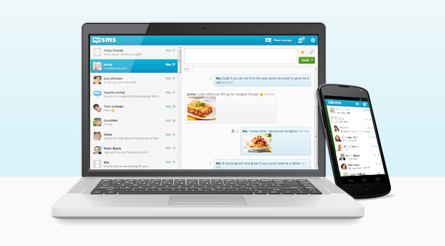
We’d like to provide you with the best experience regarding sending and receiving messages that is similar on every single device. That’s why we’re updating the design of all apps including the web app. We hope you like it!
2. Make use of extended settings
You don’t favor the current message view that shows the input field and your last messages on top? Have a look at the settings (click on the cogwheel in the top right-hand corner) and choose “Reverse message order”. Be surprised, because the view will show up the other way around.
This was a brief overview of our new implemented features and design. What do you think of it?

