Earlier this year Google issued an Ice Cream Sandwich style guide and all Android developers all over the world breathed a sigh of relief! Finally the days of adapting apps for every existing end device are over. I can tell you we put lots of effort and nerves in adjusting mysms to all the different screen sizes and color schemes out there.
Google’s guide aims to be a place where developers can “learn about principles, building blocks, and patterns for creating world-class Android user interfaces.” Android is spread across many device manufacturers, who sell dozens of different devices, each with another hardware, display and size. Also, there are thousands of developers who used to create apps in a way they viewed as the best one. You can imagine what a design chaos existed without a style guide.
We’re happy about Google’s new style guide and are pleased to let you know, what changes we made in the mysms Ice Cream Sandwich version:
1) Discover the Action Bar
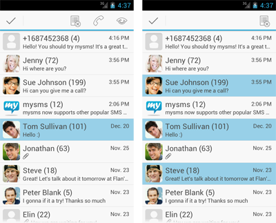
As you can see in the screenshots, you can now find an action bar on the very top. Also, we moved some items of the menu to the action bar. To see your possible actions, tab and hold a single or multiple conversations and they appear in the new Android style.
2) Know what to expect from an Icon
Throughout mysms for Android we use exclusively original Android icons, because we believe that design elements like icons have a grand recognition value. As a user you will instinctively know what to expect from a certain icon, as it will have the same function in all your apps.
3) Check out fresh Colors, Patterns & Buttons
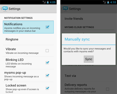
We also adjusted the colors, buttons and patterns in your mysms app. Again, we stuck to Google’s color schemes and standard ICS shapes. Buttons, windows and checkboxes are more angular now. Furthermore, the settings got a complete redesign. Its look is more coherent and stylish now, don’t you think?
4) Enjoy stylish Dialog Windows
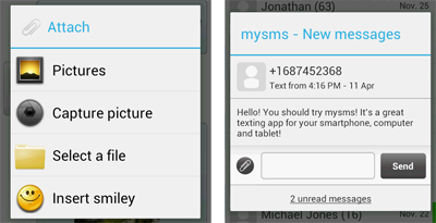
Similar to the rest of the styles defined by Google, our dialog windows got a little more angular. Additionally we gave them a new header style, of course, according to Google’s guide. You can see it for example in your pop-up or the attachment window.
All in all, these are the most significant changes we made when we adjusted mysms to Google’s new style guide for Ice Cream Sandwich. If you use Android 4.0 or higher, please get the updated version of mysms for Android on Google Play and let us know how you like it in the comments.


