Time for a massive redesign – We spent a great deal of time on giving our apps a fresh look. mysms got a new coat of paint and comes with a brand new Material inspired design. A hands on with our updated Android apps.
With the introduction of Android Lollipop (5.0), Google presented a new design concept for Android apps. Google describes it as a visual language incorporating design principles for user interfaces across platforms (smartphones, tablets, desktop, wearables and TVs). During the last few weeks we were busy implementing the new design and bringing it to our Android phone and tablet apps. So what has changed? Almost everything. Watch the video to get a first impression:
Renewed conversation overview and message view
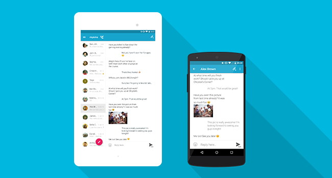
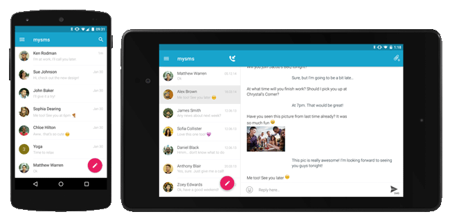
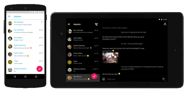
Bold colors, flat elements, clean lines and animations create a fresh user interface. The conversation and message overviews have been updated with a Material Design overhaul. It’s even easier to compose a new message with the replaced “New Message” icon at the bottom of the screen. Moreover, you can directly search for messages and have access to the new settings area.
The design of the message view has been wrapped in the latest design standard – the bubbles disappeared and it comes with the fresh Roboto font. Tap on a message to see the message details and open the menu to reveal options like calling the contact or deleting the thread. Add attachments to your messages and choose your preferred sending channel (SMS/MMS/friends) by longpressing the send button.
Gorgeous new contact view
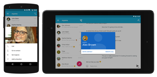
Tap on the avatar or profile pic in the conversation overview to open the beautiful new contact view – the Material Design makes it look fantastic. It includes the picture you saved for this contact (or an avatar) and some other handy options. Also the setting to choose custom notifications (sounds, LED etc.) for each contact has moved to this view.
For group chats, a tap on the avatar reveals the view where you can change the group name, add contacts or leave the group. In addition, this view allows you to view contact entries, add contacts to your address book or to send a message to individual contacts.
Manage the settings and your account information
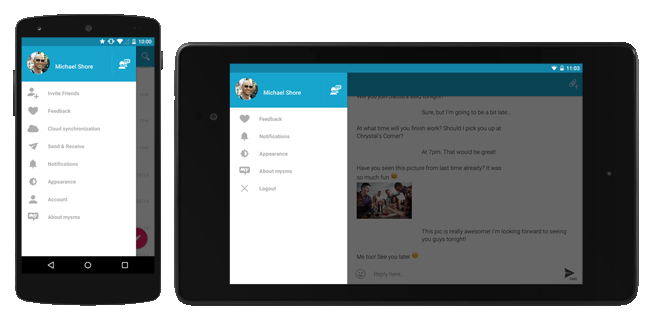
The settings area got a new structure and also found its way to the Material design – it hides in the sidebar now. We tried to cluster the countless options into a clearer structure. We aimed to make it more intuitive, so even loyal mysms users will get used to it very soon.
Stay up to date on your messages
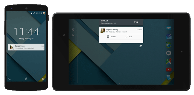
Under Android 5.0 we use Lollipop’s the heads up notification replace the popup. Please make sure that you define the right notifications for mysms in your Android settings (e.g. regarding priority notifications). For those of you who use a lower Android version, the popup is still available and also has become a new design with some great Material Design elements.
Colorful themes to customize your app
mysms is not only rocking the standard blue theme, but comes in all themes you already know from the previous version – adapted to the Material Design goodness. When you click on the pencil next to the theme (sidebar – appearance) you can customize the color of nearly every area of the app.
With this redesign mysms comes with the absolutely gorgeous Android Lollipop style. We wanted to take a step ahead Google’s radical new design approach. What do you think of our new look?
